Endangered Alphabets: The World Tour


(Double-click on these images to see larger versions.)
Well, here’s stage one of the Alphabets World Tour: a trip to Bangladesh in the hope of tracking down a script that is certainly in tiny-minority usage and may well be endangered: Mro, a tribal language and script used in the Chittagong Hill District. (Thanks to Catherine Young of SIL for bringing this to my attention.)
During the 12-hour flight from New York to Dubai on Emirates, all sorts of interesting clues show up, hinting at changes and developments in scripts, and they catch my attention even though they surface in one of the world’s least endangered alphabets: Arabic.
Emirates is, in many ways, the new global airway. Anyone who has spent any time at the airline’s home hub, Dubai airport, has glimpsed the New Asia, the massive shift eastwards of the world’s wealth and influence. Just as the skylines of Hong Kong and Singapore make Manhattan seem small, shabby and out of date, the elegant Asians make the relatively small number of Americans (and Brits) passing through seem unhealthy and threadbare.
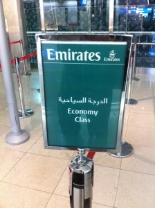
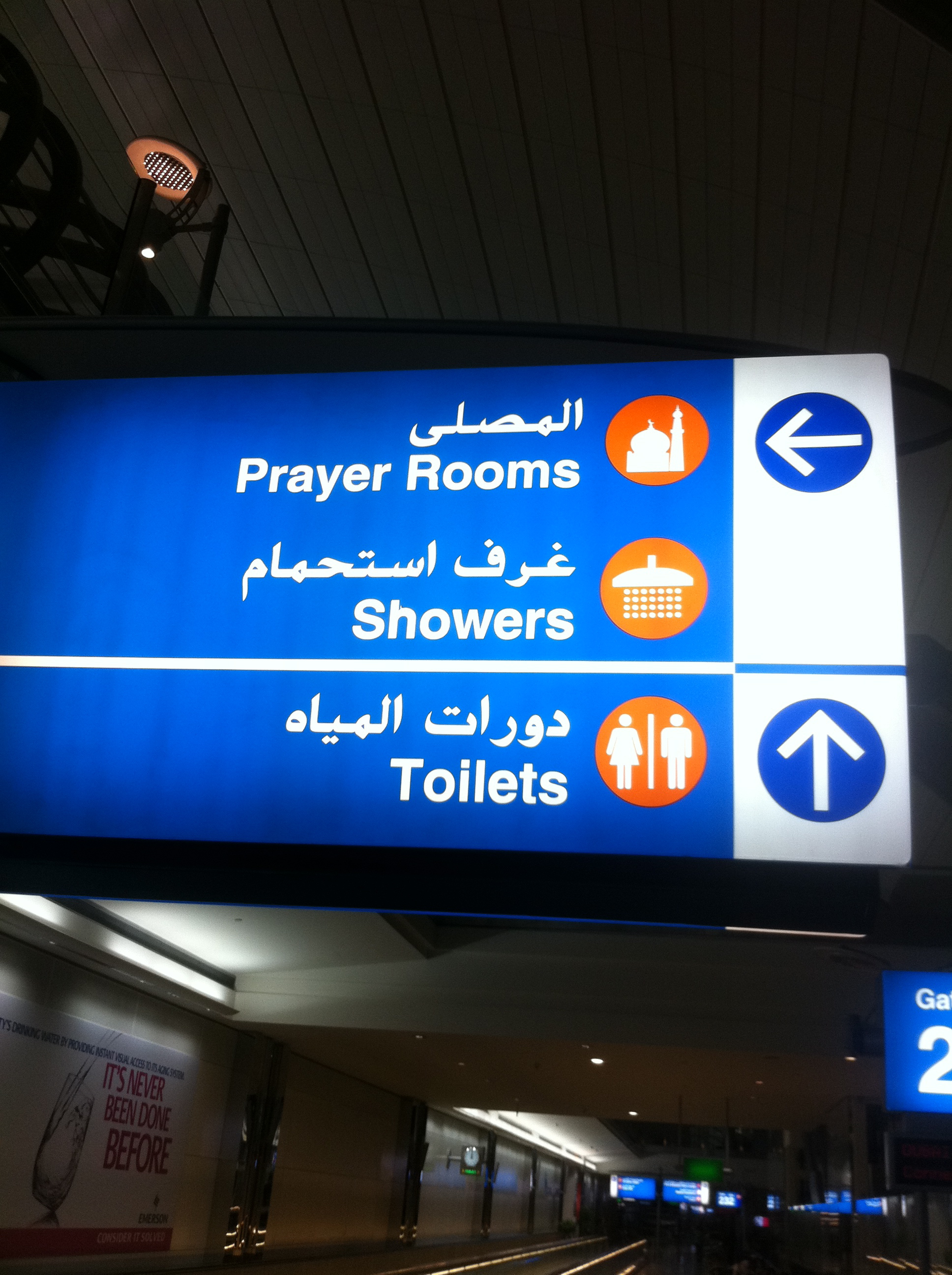
All the more interesting, then, that the signage on board our massive split-level Airbus was in both English and Arabic. English is usually the first or larger text, though this isn’t necessarily in defence to America as a world power. English is the lingua franca of South Asia (I’m sitting between a guy from India and a guy from Pakistan, both of whom speak fluent and idiomatic English), and Arabic-speaking Dubai is the entrepot, the gateway to both East Asia and South Asia. It’s fascinating, in fact, given how many destinations Emirates serves in Asia, that the airline feels in almost every instance it can do effective signage in just those two languages. I’ve seen only one sign so far—the No Smoking instructions in the lavatories—that spells out its warnings in (I think) Hindi and (I think) Urdu as well as Arabic, English and, unexpectedly, Russian.
This is the globalization of language at its most rapid and overwhelming. A cabin announcement at the beginning of the flight told us that the cabin crew could speak, between them, Czech, Polish, French, Italian, German, Arabic, Cantonese and Filipino (I may have forgotten a couple). This recognizes the polyglot nature of Emirates’ passengers, but the signage makes it clear that to get by, any Czechs or Filipinos on board had also better speak some English or Arabic.
So far, though, this is all about languages rather than scripts. But something interesting is going on with scripts, too, especially the texts in Arabic.
I really like Arabic: it’s one of the scripts that still explicitly demonstrates its origins in the handwritten word. The broader-and-narrower swoop of its letters implies a pen at work, and the Emirates logo, a structure of glyphs looking much like a Spanish galleon, speaks forcefully about the great Arabic calligraphic tradition of shaping words so they became works of art in themselves.
Most of the signs around the aircraft used this cursive, traditional Arabic script. So far, so good. But the display monitors giving the pre-flight safety instructions were a different story. The English instructions were in the same white-on-black sans serif type used on the iPhone, and to my surprise, the Arabic text was clearly a simplified or modernized form of Arabic script—a revision that had exactly the same amiably chubby rounded contours as iPhone English. Any sense that this was a handwritten script was completely gone: now it was that collision (or collusion) of printing and advertising—a font. The crisp edges of the penmanship were gone, rounded off into simpler and more upright shapes. It was sans serif Arabic, so to speak. Moreover, the bristling diacritics, which to me always make an Arabic word look like a wet black dog energetically shaking itself, had been simplified and prettified into circular dots. Even some of the running cursive connectedness of written Arabic had been broken down until the text as a whole looked the way my students’ handwriting looks: like a series of individual printed characters rather than flowing words. As if typed, in fact.
As I recall, similar simplification has taken place or are taking place in Chinese and other handwriting-based East Asian scripts. Certainly, the signage I saw in Hong Kong had made the same movement away from the brush and the hand and toward the kind of stylized, user-friendly typefaces that were pioneered by London Transport and British Rail 60 years ago.
In short, even different scripts are becoming more alike. It’s not enough that my 35 or so marginal, traditional writing systems are being replaced by a short-list of global alphabets: even the Big Six writing systems are suffering from the imperatives of global McWriting culture.
This may seem like a strange step sideways now, but stay with me. Before I left Europe, I developed a kind of deep existential dread and hatred of Elf gas stations. The point was, even though they were all clean and efficient and well-run, they all looked the same. If you were driving into an Elf station you could be anywhere in Europe—what Howard Kunstler calls “the geography of nowhere.”
But it wasn’t just the forecourts, the pumps and the buildings. The word “Elf” seemed so unlikely a name for a gasoline company, and the children’s-blocks typeface used on the signs was so far from serious business signage that I began to wonder whether the sign said “Elf” at all, and was not instead some playful arrangement of colored squares that had no semantic or phonetic meaning at all.
Maybe that’s the future of public writing: a universal set of shapes and forms that is semi-comprehensible to everyone but has its roots nowhere and in nothing.
Dubai, July 1, 2011
P.S. Later I brought this subject up with my friend Omar Khan (born in Pakistan), who looked at the issue of the handwritten-based script of Arabic from a different point of view. He said that when he learned Arabic in college, he found printed Arabic harder to read fluently than written Arabic. Somehow the cursive form represents not only the way the hand moves, but the way the mind moves. In particular he said he liked the way the diacritical marks (he said, making little flicking marks in the air) embodied that movement, that energy, the elan of writing matching the elan of thought.
He went on to say that he wouldn’t be surprised if the hardwritten Arabic script, the script of the Q’ran, was such a profound part of the identity of Islam that if some publisher took it into his head to publish the Q’ran in a modern, sans-serif Arabic, there would be howls of outrage.
What do you think? If you’re an Arabist, a Muslim, a linguist, a religious scholar–what do you think? Please let me know.
Tim


September 27, 2011 @ 6:18 am
dear Tim.
im glad to find your weblog and know that you search about endangered alphabets.
my name is Mina and im an Iranian girl . as an Ianian Muslim shall to say , yes, although that we are Iranian and our language and script is persian or parsi ( with arabic letters root) but we all must learn arabic and could read arabic to do our religious duties including read Qran. most of the people just could read and the meaning need to have translation.i agree with this part of your article : the script of the Q’ran, was such a profound part of the identity of Islam that if some publisher took it into his head to publish the Q’ran in a modern, sans-serif Arabic, there would be howls of outrage.
anyway, i have a suggestion : as you know iran is a rich country in culture, and here people speeak in some language plus many ,many local dialects, may be this subject could help you to find more and more about ariayee- hendi language and alphabets.
regards,
mina
September 27, 2011 @ 8:01 pm
Great to hear from you. But I must confess, I’ve never heard of Ariayee-Hendi, and it’s not on omnoglot.com, which is my bible. Let me see what I can find out about it, and if you have any suggestions, I’d love to hear them.
Tim