
Samaritan: the survivor script
As I start gathering information for the Word Atlas of Endangered Alphabets, calling on friends and contacts and experts all over the world to amplify the little I know, I’ve also been carving a short text in Samaritan, one of the strangest and most interesting of the world’s writing systems. So strange and interesting, in fact, I’m going to give you the chapter on Samaritan from my book Endangered Alphabets–which, by the way, you can order HERE. But if you know more about Samaritan than I do, please get in touch!
The chapter recounts my first impressions and explorations, back in 2010 when I was carving my first exhibition. It goes something (well, a lot) like this:
- Samaritan: A Thorny Twig
As I paged through Simon Ager’s alphabetical listings on Omniglot, I found writing systems that were thriving, writing systems that were extinct, writing systems that were dying and writing systems that were entirely fabricated by writers creating fictional worlds for their novels.
One language and its alphabet defied all these categories. Two thousand years ago it was being used by as many as a million people, it had dwindled to the point where it was used by only four families—yet it was still thriving, and its speakers and writers had no intention of giving it up. It was Samaritan.
According to the Bible (not exactly an objective source, as we shall see), the Samaritans were originally a Mesopotamian people who moved to Palestine around 1,000 B.C.E. The Samaritans themselves claimed to be descended from some of the earliest northern tribes of Israel, and according to DNA testing, they may have a case. More importantly for our purposes, they adopted some aspects of the Jewish religion and culture, including the old Hebrew script.
For reasons that aren’t entirely clear, a rift developed between the Jews and the Samaritans. It certainly can’t have helped that both sides accused the other of misinterpreting the Torah and making false claims to be God’s chosen people.
These arguments of faith were closely tied to arguments of language—and, unusually, of written language in particular. When the Jews were exiled to Babylon in 722 B.C.E., their Hebrew tongue and script became modified by local languages. The Samaritans suffered no such exile, and as a result some Samaritans claimed that their writing system, therefore, is the true Hebrew—and as such was the lettering that was handwritten by God and handed to Moses.
By the time of Christ, the two neighbors loathed each other. The entire point of the parable of the Good Samaritan is that it’s not the priest or the Levite, both representatives of the Jewish religious hierarchy, who help the mugged man—it’s the hated and despised Samaritan who gives first aid and puts the victim up at the nearest inn. “Which of these three was his neighbor?” Jesus asks, neatly making a point about both spiritual worth and local hostility.
Despite Christ’s endorsement, the next two thousand years were not kind to the Samaritans. Disliked by Jews, Christians and Muslims, they suffered massacres under the Christian Byzantine Emperor Zeno, were slaughtered or forced to convert to Islam by the Ottoman Pasha Mardam Beq, and by the beginning of the twentieth century consisted of only four families, numbering perhaps 120 people.
The Samaritans were not a weak-willed people, though, and their devotion to survival was as strong as their devotion to their language. If anything, they may have become more devoted to their script. By the time my small project entered this vexed history, the Samaritan population, restricted to two settlements in Nablus (a Palestinian city in the West Bank) and Holon (near Tel Aviv) had clawed its way back up to about 700, and was as proud of its language, both spoken and written, as ever.
Their librarian and chronicler, Binyamin (Benny) Tsedaka, turned out to be tuned in to the global wavelength of email, and in short order sent me several issues of the Samaritans’ newsletter, which in its recounting of activities within the extended Samaritan family was simultaneously foreign and exotic and yet familiar and chatty. He also went to work on writing out Article One, and within a few days he sent it by email.
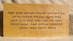
The text he sent me was decidedly odd. Each occurrence of a letter was identical, so presumably Benny was working from a computerized font—yet each individual letter was as gnarly and knobbled as a hawthorn twig. They looked positively primeval. I couldn’t figure out if this was intentional (in other words, a way of stressing that this is, after all, Ancient Hebrew, not the Jews’ imposter modern version) or simply the result of a whole lot of pixilation. It didn’t help that, once again, the letters bore only a passing similarity to those on Omniglot.
The letters also had a distressed or textured quality: it was as though they had been written on an uneven surface, perhaps a rock, two millennia ago, and the textured surface of that rock had entered their soul. As a script, it seemed not orthographic but archaeological, as if someone dug up just one set of writings scrawled under adverse circumstances on an unsuitable surface. I imagined what it would look like if I were the last survivor of the human race, with only a week to live, writing the history of the world on my driveway with sidewalk chalk–and then, aeons later, alien visitors found my hasty scrawl and reconstructed not only its meaning but the alphabet in which humans seemed to have written.
Staring at each letter, with its spray of horns and spikes, I found myself thinking about writing the way Bernd Heinrich found himself thinking about bumblebees—in other words, in terms of economy.
Imagine a language in which each symbol were so complex that to make the letter F you had to paint an exact replica of the Mona Lisa, and the slightest error in shading on her cheek changed it from an F to an 8w∫√˚ç†. Writing would take too much skill, and/or would simply take too long. I remember reading in the Guinness Book of Records that a tribe in New Guinea counted only as far as 3 because the word for “three” was so long it would take an eternity to count to 4.
As I worked on the image transfer of the Samaritan—in other words, filling in the letters that I merely outlined through the carbon paper, and picking up lines I missed or got wrong—I was struck by further thoughts on this subject, and came up with what might be called a Law of Economy of Shapes.
When we think of the English alphabet we think of 26 different letters, but once we break letters down into their constituent parts, it becomes clear that English consists of a smaller number of core shapes, with varying extensions. Thinking just of lower-case letters for now, we see that n, m and h all have n in common, with differing extensions for m and h. Likewise d is an extension of a, and w is an extension of u. Other letters are in effect reversals of the same shape.
This similarity—in Latin letters, at least—is partly a function of the developing monastic handwriting styles of the scribes of the Middle Ages. In developing what was the first recognizable modern cursive form of our alphabet, the combination of quill and paper meant that certain motions were simply easier than others. (As a schoolboy who was taught to write with a metal nib, I learned all too soon what hand-motions produced clean lines and which produced scratches, blots or torn paper.) The easiest and most efficient motion was a downward stroke, with variant curves at top and/or bottom, which we now call the minim. The monks became so enamored of the minim-shape that letters containing multiple m’s, n’s, i’s, u’s and w’s, such as the word “minimum,” became almost impossible to read. This, by the way, is when the lower-case i developed its dot: an i was indistinguishable from neighboring minims, causing great confusion, so it was given the overhead dot to make it stand out.
Other languages, too, have their favored shapes. Bugis has that boomerang-shape embedded in virtually every letter; Sundanese (also from Indonesia) seems to consist almost entirely of variations on the numeral 7, both of which are a simple up-and-down or out-and-back turn of the wrist.
This repetition makes perfect sense when you remember that every alphabet has to be learned, and you think of numbers and the Rule of Seven. When asked to memorize increasingly long numbers, we apparently do okay until the numbers get longer than seven digits, at which point our retention drops off abruptly with each added numeral. That’s why we can remember our phone numbers but not our credit card numbers. Too little variety, and you haven’t got an alphabet capable of expressing all the sounds you want to represent. Too much variety creates a point of diminishing return.
As I penciled the Samaritan script, I started noticing the same shapes being repeated. There was a formation like a crest or a crown that had two or three peaks, and it appeared on its own or as the top of an extension that swept down and around like a capital J. Likewise, there was a trapezoid that turned up in various guises, and a triangle that could be solid or hollow, and what I thought of as a comb-shape that might have two or three tines, and might have a complicated sort of handle. These shapes repeated themselves so often, in different combinations, that it was almost a surprise when I came across a completely different kind of letter.
It has been so long since we learned our letters that we barely even think in these terms any more. We can understand learning letter combinations (that is, learning to read words) because most of us, especially those of us who speak English, have at least a few words we have to think about in order to remember how to spell them properly. But once upon a time, when we (as individuals or as a civilization) were in our infancy, we had to learn shape-combinations, and it would have been much harder if our alphabet went a, b, 7, #, ‰, ∏, Ø, Ï, , Æ, ⁄, random inkblot, €, ‡, ¿, and so on through to z. It has been suggested that there are deep structures underlying all syntax; as the neuroscientist Stanislas Dehaene has discovered by watching individual neurons fire in the human brain, there are deep structures in letters.
Dehaene hypothesizes that there are also archetypal symbols that turn up in multiple writing systems. For example: I described one core letter-form in Samaritan as being shaped like a comb. There must be a kind of (perhaps unconscious) metaphorical borrowing in the shapes of letters. Letters with prongs. Letters with right angles. Letters with legs. Letters with heads, or hats, or lids.
But is the letter as visual metaphor more important than the letter as physical act–the turn of the wrist, the movement of the hand left or right across the page? Or the letter as technical product of this particular writing tool on this particular surface? Or do all letters feel the influence of these three forces, mental and physical?
Maybe if I carve every script in the world, I’ll be smart enough to answer this question.
****
Once I started carving the Samaritan text, my mind started playing an odd trick on me: I kept thinking of Sherlock Holmes. For some time I couldn’t imagine why, and thought I was cracking up from spending too long squinting at incomprehensible squiggles—but then I realized I was thinking specifically of the story “The Adventure of the Dancing Men.” I can’t remember the details of the story, but I do remember that the plot involved a code or cipher that consisting of several lines of drawn stick figures that represented, in a kind of crude semaphore, individual letters that composed a vital message some villain was sending to another.
It finally hit me that the Samaritan characters, which have a Kokopelli-like quality, were reminding me of Conan Doyle’s hunched but dancing stick figures. It’s also noticeable that not a single letter is vertically symmetrical and therefore “balanced.”
By contrast, a Greek inscription dating to 334 BCE honoring Alexander the Great is a model of vertical stability: if its 47 letters were individually made of, say, stone, and were stood on a flat, level surface, only two would fall over. And the Romans adopted these qualities from the Greeks.
Is this an illustration of the influence of architecture on alphabets? Latin capitals (the word itself is an architectural term) in particular seem to want to take on the qualities of buildings, especially temples or columns: well-chiseled, upright, balanced, permanent. Hence the development of serifs: they look like the base and capital of a column, and imply stability. I wonder how conscious this was, and how deliberately Roman sculptors and masons developed their statuary and ceremonial fonts not only to be easier on the chisel but also to embody the dignity and bearing of the gods and generals they were commemorating. The Roman A lettered on the Emperor Trajan’s column, one of the most influential pieces of lettering in the Western world, could not look more like the legs of a colossus, bestriding the known world.
In some cases, we can actually watch this letter-architecture taking place. The earliest Semitic alphabets indicated the sound “r” by borrowing an Egyptian hieroglyph of a man’s head in profile because the Semitic word resh meant “head.” The symbol for R, then, was what we would call a P. (Technically a backwards P, because, as with many letters, it reversed direction over the next thousand years.) Over time, though, the capital R has grown a support, looking very much like a 2×4 shoved in diagonally to support a wooden porch while it’s being rebuilt. It has become more stable.
Here’s the thing: the human brain processes symmetrical shapes more readily than asymmetrical ones. It’s partly why our notions of beauty include symmetry: balanced shapes require less attention, less work, less vigilant wariness. Maybe that’s also part of the history of writing: over time, our symbols for words and letters converge with our other concepts of what looks harmonious. In its refusal to change over the millennia, Samaritan is clinging to an older standard.
We can see the effects of this architectural thinking even today. Typing these words on my laptop (using my default font American Typewriter), I couldn’t help thinking how each letter had a rotund solidity. The lower-case r overreached itself somewhat, but most of them just sat on their line, contented as fat pigeons on a phone wire. Some of them even seemed to have been designed to denote stability and endurance. Nobody could knock that m over, or that u or that n or even that a. The p was hammered into the ground like a For Sale sign.
By contrast, the Samaritan letter that looks like an m isn’t even level: it cants from northwest down to southeast as if running, or approaching the reader. The more I looked at these letters, the more I liked them. Samaritan was a fascinatingly dynamic-looking language, and, like the Dancing Men, had those twin qualities of movement and mystery.
***
As if a language spoken by fewer than a thousand people wasn’t eclectic enough, I discovered to my surprise (again, thanks to Omniglot) that Samaritan has an even more unusual hidden identity: it’s the secret language of Freemasonry.
Even here, though, lurks a strange sectarian rivalry and disputed histories.
Albert Pike (1809-1891), was a teacher, would-be trapper, journalist, lawyer, poet, Confederate Envoy to the Native Americans and just one of those ornery guys who are offered an honorary PhD from Harvard but turn it down.
He was also a Mason, and wrote Morals and Dogma of the Ancient and Accepted Scottish Rite of Freemasonry, a book that some Masons regard more or less the same way that Jews regarded Samaritans. Hardly surprising, really, as the book includes contentious (and cryptic) passages such as : “The Pagans accused the Christians of worshipping an ass, and they did not invent this reproach, but it came from the Samaritan Jews, who, figuring the date of the Kabalah in regard to the Divinity by Egyptian symbols, also represented the Intelligence by the figure of the Magical Star adored under the name of Remphan, Science under the emblem of Anubis, whose name they changed to Nibbas, and the vulgar faith or credulity under the figure of Thartac, a god represented with a book, a cloak, and the head of an ass. According to the Samaritan Doctors, Christianity was the reign of Thartac, blind faith and vulgar credulity erected into a universal oracle, and preferred to Intelligence and Science.”
Pike’s theology may have been controversial, but nevertheless his introduction of certain Samaritan, Phoenician, Egyptian and Hebrew images into the rituals and regalia of the Scottish Rite seems to have stuck.
Utterly out of my depth, I drilled back down into the labyrinthine links branching from Omniglot and came across the name of Shawn Eyer, an adjunct faculty member at John F. Kennedy University, the editor of Philalethes: The Journal of Masonic Research and Letters, creator of a Samaritan font for the Masons, and apparent possessor of some secret rank within the Masons, given that his name appeared on the Web followed by a capital P, then three dots in the classic mathematical “therefore” arrangement, then a capital M, then another “therefore.”
Hmmm. Clearly, I was moving deeper and deeper into Dan Brown territory. I tried to download the font to see how it compared with Benny’s Samaritan, but the link was broken. The origin of the page, though, was “Academia Lodge No. 847,” described as “a Traditional Observance lodge in the San Francisco Bay Area, working under the jurisdiction of the Most Worshipful Grand Lodge of Free and Accepted Masons of the State of California.” The lodge was named for “the scared grove in Athena where Plato and his students engaged in open dialogue about geometry, ethics and philosophy,” and that this lodge has borrowed the name Akademia because it stands for “lasting truth and…open inquiry.” The concept of a secret society (using a foreign language and an almost-dead script for its rituals) promoting open inquiry left me deeply confused.
Astonishingly, an email to Shawn Eyer produced almost immediate answers. Why, I asked, did Pike import Samaritan letters and words into his version of the Scottish Rite? Eyer suggested two possible reasons.
“First, the Samaritan forms preserve, more or less, the paleo-Hebrew glyphs. Being closer to the form of the alphabet in King Solomon’s time, Pike would have favored them for this reason. While the exact forms Pike used are NOT that ancient, he was likely unaware of this. So the first reason is a (correct) assumption that the Samaritan letters more accurately reflect the most ancient forms.
“Next, sheer mystique. You HAVE to learn how to read these letters, or just admire them as decoration… whereas it was not that uncommon to find someone who could transliterate Hebrew characters. Mystery is a significant part of Freemasonry—with the whole point being the intellectual engagement of the initiate. I can provide examples of the usage of Samaritan lettering on Scottish Rite jewels which illustrates this likely motivation. Note that by mystery and mystique, I do not suggest obfuscation. We know that Pike wanted keen students to learn what these letters were, because he published a book, Sefer ha-Debariam (The Book of the Words), which lays the subject quite bare. I can provide that book to you electronically should you have a desire to see it.”
At this point I became convinced that if I investigated any farther I’d be found dead, naked, and splayed out on the floor of the Louvre.
All the same, one point remains, glowing like mystical letters in a B movie of Nebuchadnezzar’s downfall: even when a language becomes functionally extinct, only one layer of meaning has been stripped away. It no longer means anything in a literal way (“elbow,” “appreciate,” “alcoholic beverage made using barley, honey and crocodile dung”) but something about those letters sets them apart from casual marks and scratchings. There’s a sense of purpose and intent in the shaping of a letter that survives for centuries, even millennia. It’s like a Neolithic stone circle: even if we don’t know for sure what it was built for, it was clearly built for something, and the fact that we don’t know what may actually make the letter or the construction even more potent, more challenging.
The Samaritans and the Masons may dedicate themselves to the survival of the Samaritan script for different reasons, but the fact remains that the letters remain.
I’ve finally remembered the other thing the Samaritan letters remind me of: it’s the description one of my travel writing students wrote of a single twig of the desert cactus-shrub Euphorbia Milli that grows throughout the infertile soil of the Middle East. We know it as the Crown of Thorns. Each Samaritan word recalls its spiky, stubborn history, determined to outlive us all.
Again, if you’re interested in order my book Endangered Alphabets, you can do so HERE.

July 14, 2018 @ 11:29 pm
Fascinating.
And really great writing.
Thank you
February 13, 2023 @ 7:10 pm
Lovely article! Just to satisfy curiosity, P.•.M.•. Means “Past Master”. Nothing too scary or arcane.