Handwriting: What Is At Stake?

The next phase of the Endangered Alphabets Project is to take a short poem I’ve composed, translate it into as many as sixteen endangered scripts (please contact me by email if you’d like to help, as I have need of many collaborators!), and carve these poems into a multi-faceted memorial, the designs for which I’ll post shortly.
After my experience with the original Endangered Alphabets exhibition, I decided that (a) I’d include a version of the poem in English, so people will know right away what all the other versions say, and (b) that rather than copying some font or other I’d use my own handwriting.
Here’s the point: all typefaces or fonts are essentially an amalgamation or median version of the wide range of individual styles. In the name of consistency and legibility they sacrifice all the variation that makes writing so much an expression of the individual character, or even the individual character at an individual moment. With those stirring sentiments in mind, I started to examine this strange skillset I call my handwriting.
The first thing I realized, having never thought to examine it before, was that the handwriting I use is almost nothing like the cursive faux-copperplate handwriting I was taught, like everyone of my generation, back when I was seven or eight. For one thing, I use a Greek lower-case “e.” This is despite the fact that my history teacher at grammar school used a Greek epsilon and delta for his e and d. His method of teaching was to write notes on the board we had to copy. His handwriting was so indecipherable that it might as well have been Aramaic, but anyone who asked him to clarify a word got at best a scowl and at worst a beating. No, I picked up my Greek e from my friend John Jenkins, who at 14 had hand-printing so perfectly formed we referred to it as typing.
I guess at 14 we’re all looking for a personality, and one of the many ways my own search manifested itself was in appropriating John’s epsilon. My writing in general was appalling, a product of haste in execution and uncertainty in personality, made all the worse by the fact that I mostly used a ballpoint. When I wrote with a fountain pen the breadth of the nib and its disposition toward downward strokes had a calming effect on me, and for a while I actually took pride in my script. But my adolescence was inexorably moving toward national exams—four essays in three hours, in every single subject—and under this pressure my fountain pen and my graceful-ish hand was just too slow, and I lapsed into felt tip pen.
At school in general, handwriting was seen as a species of vanity. Our Head Prefect, who admired himself beyond all measure, spent hours practicing his signature—so much so that at least a dozen of us could handily forge it on official documents. Another student cultivated a nifty backwards loop on the descenders of his g’s and y’s, a skill that was roughly 20% admired and 80% despised.
I was already noticing that boys and men were allowed to cultivate personal or even eccentric styles, while girls and women were supposed to stay close to the copybook. My father’s hand was most peculiar: anything but smooth, his writing consisted of a series of clusters or quanta of letters rather than sentences or words. His lower-case r, for example, rose and arched so extravagantly that no following letter could possibly by joined to it, so the word had, in effect, to start again after it. Watching him write was like watching a series of small, silent fanfares. His signature, R.C. Brookes, could have been set to music, three blasts on the brasses followed by muttering in the cellos and basses, punctuated by the rise and fall of the k.
During my adolescence and early adulthood my own signature went through all kinds of experiments, most of them trying to combine the self-importance of my initials with the dashing quality of the rest of my name. It was changed for ever, though, in my forties when one of my books was bought in book club edition and I had to sign 400 bookplates to be affixed inside the front cover. Somewhere between signature 50 and signature 100 everything unnecessary was tossed overboard, and what had been a moderately legible representation of my name was abandoned in favor of a sketch, a gesture that began with a T and a B, and everything after that was a single art nouvean/Alphonse Mucha curl. In art terms, it had gone from representative to gestural.
So much for general observations. But what would it be like to try to write something that not only will represent me as a person but needs to be carved, painted and made permanent? It’s a challenge most writers never have to face, and it disturbed me more than a little.
The poem, intended to be a kind of anthem for endangered alphabets, goes like this:
These are our words, shaped
By our hands, our tools,
Our history. Lose them,
And we lose ourselves.
At first my hand seemed spastic, almost uncontrollable. I’ve noticed that this is a function, apart from anything else, of time of day: when I’ve just woken up, my hand is calm, my writing smooth and orderly, but as the demands of the day pile up it’s as if my hand, as an extremity of my body, expresses and even magnifies the contradictory forces and tensions in me, like a feather tied to the radio antenna of a car.
As I tried to relax into what I was writing, I found that, despite having spent more than fifty years writing by hand, certain letter-combinations came more naturally than others, which behaved as though I’d never written them before. I wrote a single line again and again, just getting used to the feel of the words.
After more than two pages of practice, I noticed something else was happening: my sense of what I wanted the lines to express was beginning to emerge and take over the sheer pedestrian task of putting the wo0rds on the paper.
The initial T began to look more like the first (and only legible) letter of my signature–an emblem, a signet, something written with pride and declarative intent.
Same with the B at the start of the second line: both letters were the visual equivalents of small trumpets, heralding the purpose of the words to follow, and with each iteration the B spread out a little more, beginning a little farther to the left and swooping a little farther out to the right as if the upright represented solidity and caution while the curved horizontals billowed out like sails.
Likewise the Y at the end of “history” went beyond being a mere descender and started to flare out to the left like a fishhook. Interestingly, that degree of expressive flourish made it increasingly hand to follow it with a simple dot as period or full stop. It was as if I just couldn’t stop the music, and the more glee went into the Y, the more the piece of punctuation that followed looked like a comma or even a small slash rather than a sedate and punctilious Punkt.
Other problems arose as the tension grew between the need for consistency and the desire to say what I felt. The two O’s in “tools” refused to be the same size. Every R came out differently, depending on what had gone before or what was coming next. Sometimes I found myself crossing the T of “tools” immediately after I wrote it, sometimes after I’d written the whole word, in which case the T-cross was much longer, and acted as a roof-beam for the entire word.
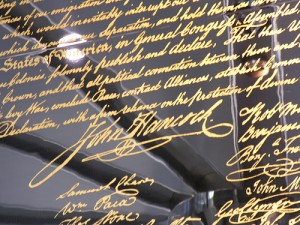
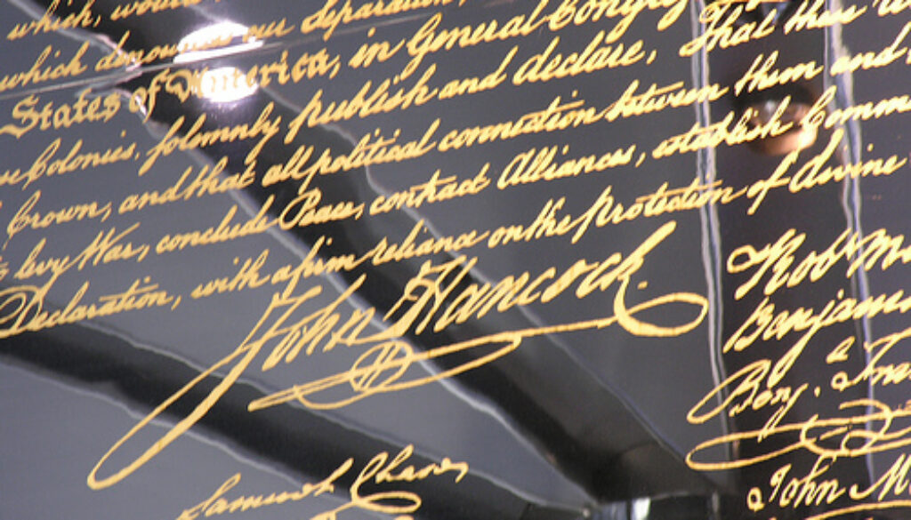
The one problem I never solved to my own satisfaction, though, concerned the final line. Anyone who has seen the signature of Queen Elizabeth I or John Hancock knows that the principal opportunities for ornamentation—in other words, self-expression—arise at the beginning of a word and at the end. The opening T of my poem, as I’ve said, had the same wind-up-and-pitch quality it has in my signature. But the end of the poem consists, quite by chance, of letters and words that are visually tame. All we’ve got, after that initial A, in the way of ascenders and descenders is a couple of L’s, and as the song might as well say, L is the loneliest letter. No character to speak of. And every other letter is caught between those parallel horizontal lines that medieval monks used to develop the uncials and half-uncials that were so restricted that it’s hard to tell where one letter ends and the next starts. Well, perhaps not quite that uniform and characterless, but it was unmistakably true that every time I wrote that last line, especially when I was trying to write the whole quatrain rather than just practicing the line on its own, there was a sense of let-down at the end. What should be a grim, even apocalyptic warning was just one word after the other, with a period shutting it all down at the end.
Anyone interested in supporting the Endangered Alphabets Project can do so in one of two ways. The book is my sole source of income for the Project, so buying a copy (by clicking on the Buy Now button at the head of this page) will be a great help. Just as useful, though, is help in translating the poem into endangered scripts. If you have that expertise or know someone who might, I’d love to hear from you.

